SWISSFILMS
Microsite Experience Design
Highlighting the best
in Swiss filmmaking
Created as a course project in IAT438 (User Experience Design) this microsite was a project focused heavily around content design. We created a digital experience to support SWISS FILMS' mission by leveraging filmmakers' unique talents to foster future collaborations.
The Client
SWISS FILMS is an agency working to increase the exposure of Swiss filmmaking. They offer travel funding, subtitling facilities, pre-screening networking events for directors and they place Swiss films in film festivals worldwide.

Visual Branding
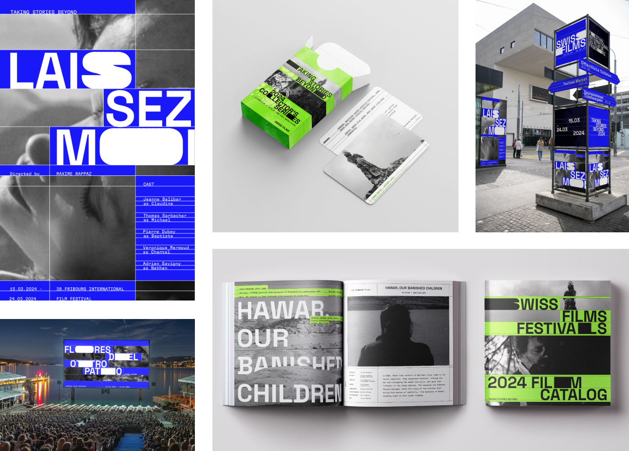
This was a 5 week project, with the first 3 weeks being focused on developing a visual identity which we would then carry forward to our microsite. These were our final results, including a poster and multiple other assets, primarily focused around the idea of using lines to structure content and stretching letters to create shapes.

Focusing Our Approach
The existing SWISS FILMS website hosts a comprehensive library of content about Swiss films, filmmakers and film festivals. Initially we started our framing around the idea of showing more behind-the-scenes details to engage audiences with the people involved in the films. However, we wanted to ensure our microsite could create real value beyond what already existed on the SWISS FILMS site, so we shifted our target audience to other filmmakers and decided to focus our content strategy around creating connections and promoting future collaboration.
Our Framing
How might we leverage the compelling qualities of the production team through an immersive experience in order to foster future collaboration?
Main Navigation
With our focus on creating connections between filmmakers we took a unique approach to the copy writing of the site, chosing words to emphasize the grandness and importance of each role.
The main way to navigate is to click into the category names. Scrolling leads to a secondary navigation which offers an alternative, more functional way of navigating the same content.
Clicking on a category leads to a list of associated names which, upon hover, offers a sneak peek of their work as a full bleed video. It also uses an impactful one liner to highlight a significant fact about them.
Content Organization
Each artist has their own page filled with scattered film stills. Hovering on an image provides details about their career, highlighting their achievements to reinforce a sense of grandeur around each individual. These little hints about their work is meant to spark interest about them and hopefully lead to the visitor clicking into their portfolio link to learn more or get in touch. However, if the visitor wants to see more before moving on, clicking into an image brings a popup allowing them to go deeper into the content.
Each popup contains information unique to each crew member, segmented in 2 groups: design process and creative collaborations. Creative Collabs here is a showcase of the big names they worked with to show their versatility across roles and teams.
The process page will look different for each person. Since directors have a more prominent presence in the creation of the story, this page display interview clips, which are a form of communicating process and intent. Other ways might include breaking down scripts and stills and understanding the variance in the art of storytelling for each director, producer, and writer.
Other categories of filmmakers have different types of content highlighting their role, like sound-based roles having audio-based content, or cinematographers having film stills and accompanying text breaking down their intentions.
My Contributions to the Project
While this project was overall a team effort, as each week was wrapping up we would divide the work and have each of us focus on our strengths. In doing this, I had a focus on the prototyping and created most of the final functional prototypes. In an earlier week when we were still diverging into multiple microsite designs, while someone else had the initial idea for the homepage and filmmaker listing, I was the one who developed that idea further into what became the structure of this final site, seeing how we could build the entire site around the shifting rows, creating new areas for content within the same space. I was able to apply my motion design knowledge into these page transitions, helping to translate the original visual identity into an adaptable moving system. I was also heavily involved in creating many of the asset mockups in the visual design phase of the project.
Reflections
Throughout this project, I learned a great deal about content design and and expanded my understanding of how digital experiences can create new and unique value for a client. We put a lot of effort in really exploring the values and mission of our client, and in doing so were able to find a space where we could add value to Swiss filmmakers beyond what SWISS FILMS had already done, while perfectly aligning with what SWISS FILMS aimed to do. Visually and structurally I am very satisfied with the website design, creating unique pages that can engage a visitor throughout the whole experience, feeling cohesive but not repetitive.
Moving forward, the areas I think could be improved are the popups where the deeper content is surfaced. Throughout the navigation experience, we slowly reduce the amount of blue used so that the artists' work is what stands out once we get to the content pages. However, we re-introduced large amounts of blue in the popups which I think could be removed or minimized in order to let the artists' work take back some attention. There may also be room to visually redesign the popups, as some of the line work feels more connected to some of our original visual assets created before the site, rather than the more row-based implementation present in the rest of the site.
Looking for my next opportunity!
Contact Me
I've worked with some great companies, yours could be next!


